Yes, and when it's done right, it's one of the most effective things you can do to a space. Here's exactly how to make it work.
Mixing two wallpapers in one room is one of those ideas that makes people hesitate. It sounds like something that could easily go wrong. But it's also the technique behind some of the most beautiful, layered interiors you've ever seen.
The difference between a room that looks intentional and one that looks like a mistake isn't luck. It's knowing three specific rules. Get those right, and combining wallpaper patterns becomes one of the most powerful tools in your decorating toolkit.
Why mixing wallpapers works when it's done properly
A single wallpaper on all four walls can feel flat. It gives a room one note when it could have three. Using two wallpapers creates depth, draws the eye to a focal point, and makes a room feel thoughtfully designed.
This is exactly why interior designers rely on the feature wall approach. One wall carries the statement. The other walls frame it.
The three rules that make it work
Follow these three and your result will always feel cohesive.
01 Keep them in the same colour family. Warm tones with warm tones. Cool tones with cool tones. Your two wallpapers don't need to match, they need to share an undertone. Cream and terracotta work. Soft grey and dusty blue work. Cream and icy grey? That's where things start to feel disconnected. The shared undertone is the invisible thread that ties the room together.
02 One should speak louder than the other. They should never be equally bold. One wallpaper carries the statement: the pattern, the texture, the character. The other stays quieter and simply supports it. A bold limewash plaster needs a calm linen beside it. A striking geometric needs a natural grasscloth to breathe against. When both wallpapers compete for attention, neither wins and the room feels exhausting.
03 Assign roles clearly: one feature wall, then the surround. One wall gets the statement wallpaper. The remaining walls get the supporting one. This structure is what gives the room clarity, and clarity is what makes a bold choice feel confident rather than overwhelming.
Which wall should be the feature wall?
It's simpler than most people think. The feature wall is simply the one your eye naturally travels to first.
In a bedroom, that's the wall behind the bed. In a living room, it's the wall behind the sofa. In a dining room, it's behind the table. If you're not sure, ask yourself: if you had to hang one large piece of art in this room, which wall would you choose? That's your feature wall.
One thing worth noting is that it doesn't have to be the largest wall in the room. It just needs to be the most purposeful one.
Three wallpaper pairings that work every time
Here are three reliable combinations that follow all three rules and can fit in any space.
Pairing 01
Raw and Grounded


Statement wall: Limewash Effect Plaster Surrounding walls: Warm Taupe
The limewash brings energy and tactile texture to the room. The warm taupe pulls everything back down to earth. Together they sit in that rare space between refined and lived-in. These work beautifully in a living room or main bedroom where you want warmth without heaviness.
Pairing 02
Weathered and Nordic


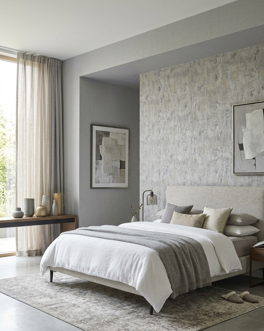
Statement wall: Distressed Plaster Surrounding walls: Cool Grey Linen
This pairing makes a room go quieter. Cooler. More considered. The aged character of the distressed plaster gives the space soul and history. The cool grey linen keeps everything restrained and calm around it. If you want a bedroom that functions as a genuine retreat, this combination delivers it. It's a particularly strong choice for smaller rooms, where cool tones keep the space feeling open.
Pairing 03
Handmade and Organic


Statement wall: Distressed Geometric Surrounding walls: Natural Grasscloth
Both wallpapers feel like they were made by hand, and that shared quality is exactly what ties them together. The geometric anchors the room with pattern and structure. The grasscloth wraps the remaining walls in organic warmth. The result is layered and sophisticated without feeling overdone. This pairing works especially well in dining rooms and home offices where you want a space that feels thoughtful.
Mistakes that make two wallpapers look wrong
These are the most common reasons a two-wallpaper room doesn't land.
01 Choosing two patterns of equal visual weight. If both wallpapers are bold, the room has no anchor. There's nowhere for the eye to rest.
02 Mixing undertones without a deliberate reason. Warm and cool tones don't naturally sit well together. The room ends up feeling off, like two different moods competing in the same space. Most people can't explain why it bothers them, but it does.
03 Putting the bold wallpaper on too many walls. One feature wall is enough. The moment the statement wallpaper wraps two or three walls, it stops being a statement and starts being the whole room, which defeats the purpose of mixing at all.
04 Choosing wallpapers that have nothing in common. If one is very ornate and the other is very minimal, they won't have enough shared character to work together. Your two wallpapers don't have to be similar, but they do need some common ground, whether that's texture, mood, or the era of design they belong to.
Not sure where to start? Try this first.
Choose one wallpaper with real character: a plaster effect, a geometric, or any bold texture, and use it on your feature wall only. On the other three walls, go with something neutral and tactile: a linen, a grasscloth, or a soft plain weave. It's the lowest-risk version of this technique and still one of the most effective. You get all the drama of a statement wall without the room feeling overdone. And once you see it in your space, you'll want to go further.
Ready to find your pairing? Everything you need is in our collection, from bold statement wallpapers to the perfect supporting textures. Shop the collection here.